When the name XDREAM DESIGNS was conjured up back in 2001, it was a result of my vast interest in extreme sports at the time. I was young and risk taking was second nature. I set forth and registered the business name because it was representative of the lifestyle I led. Sticking with this name over the years continued to make sense until my work and my level of maturity evolved alongside.
Returning to school was an incredible personal investment that has provided not only extensive retooling, but the credentials to help support the journey forward in this diverse + dynamic industry. I began embracing the world of web design and the programming that came with it. This is when I took the business name I grew so comfortable with and brought it into a Flash based website.

After a couple years of trying to make the brand XDREAM DESIGNS work for me and fit everything into that mold, I decided to sit down extensively and brainstorm towards a new strategy. I wanted something that would speak more to my current philosophies and approach to graphic design, advertising and web development. As I moved forward with this concept, I was finding myself getting carried away with the bells and whistles of creating an interactive experience, rather than focusing on creating an architecture that would house my body of work. I knew during this stage that I wanted the word “BRAIN” integrated into the brand to represent that this is an intelligent source for creative ideas.
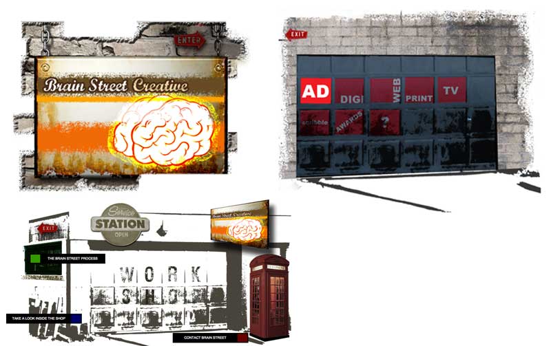
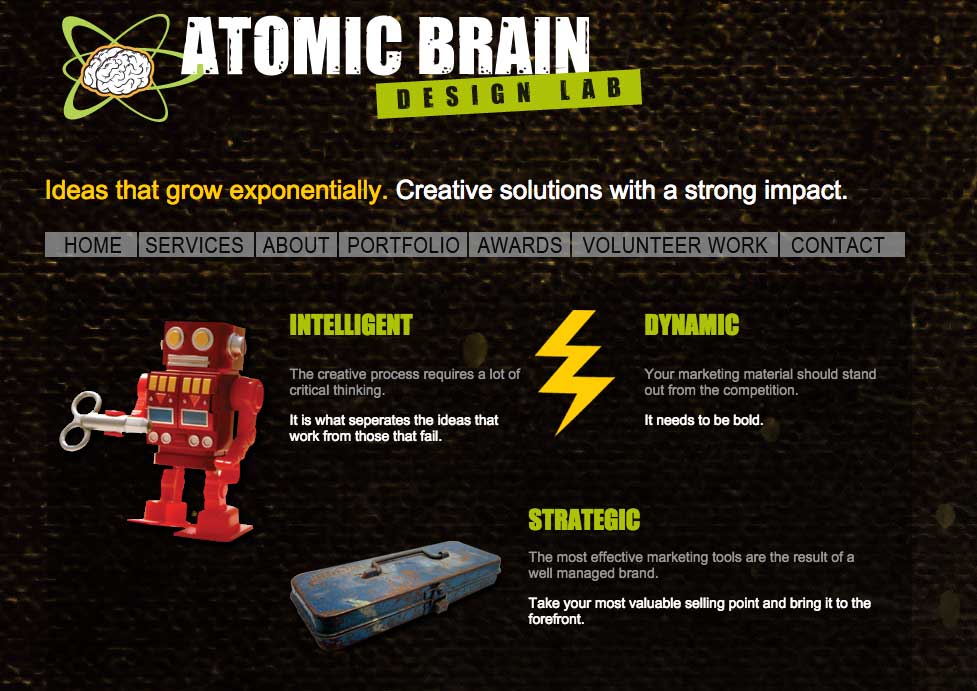
While continuing forward with this notion that the word “BRAIN” was critical for this new brand I was trying to form, I changed the name up slightly and started working towards another outside-of-the box style of marketing this brand. I was working vigorously to streamline the navigation in a way where the content would be very neat and tidy. However, despite my efforts, this branding strategy just wasn’t speaking to me the way I’d hoped it would. This idea also went to the backburner but continued to pick away at it from time to time.
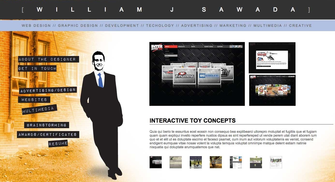
Below is another site that I began building from scratch. This one was being designed to showcase my work as an individual, rather than as a business and entrepreneur. Instead of embracing the benefits of a CMS environment, I found myself enjoying the nuances of navigating through mountains of code by creating working sites from the ground up, without the help of templates and pre-written modules. This is quite time consuming, but become labours of love and provide me a real hands-on learning experience when it comes to getting various scripting languages working together in my favour.
I was beginning to get quite frustrated that each direction I took, led me to another roadblock. I knew that I needed something bolder and more indicative of who I am and how far I have come as a creative professional. This is where “10/tenths Design + Communication’ comes in. After a great deal of research, sifting through lists of nautical, astrology, astronomy and programming terms to find something that could become a great metaphor for what I do. That is when I stumbled upon this motorsport reference that I felt was truly fitting and spoke directly to how I approach each new challenge. Below is the original logo concept, but did not translate well to letterhead—too bad, thought it captured it quite well.
